Introduction to Accessible Documents
When sharing electronic documents in a course, it is important to remember that some students will need to transform that document into a format that meets their needs. This could be increasing the text size, using a screen reader, or converting to braille. There are some basic design and style tips that can be used with any document, regardless of format, that will make the document easier to use for everyone. When creating a document, consider these tips:
- Use a readable font – serif fonts such as Tahoma, Calibri, Helvetica, Arial, Verdana, and Times New Roman are recommended
- Use the headings and other paragraph style options already installed in software such as MS Word
- Use lists to break up text and add organization
- Use meaningful hyperlinks instead of listing the URL in your document
- Add alternate text to images (see our Tips on Alt-tags and Beyond Alt-tags)
- Identify document language which helps screen readers interpret your document
- Use the Accessibility Checker if available in your software
Accessible MS Word Documents
Here’s how you can use these tips with MS Word:
- Use a readable font – serif fonts such as Tahoma, Calibri, Helvetica, Arial, Verdana, and Times New Roman are recommended.
You can select your choice of font from the Home Ribbon when you begin your document. If you want to change the font of an existing document, place your curser at the very top of the first page and use Ctrl-A on the key board to Select All. Then change your font. You may need to change the font on the Header and Footer menu if your document includes these.

- Use the headings and other paragraph style options already installed in software such as MS Word.
Instead of changing font size or using bold for your headings, use the Styles options by access Styles from the Home Ribbon.Image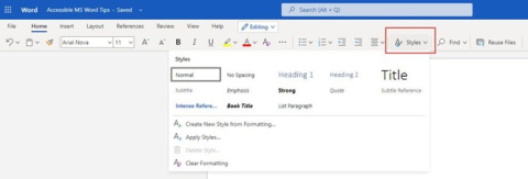
Use other paragraph options to format your document rather than adding lines or using tabs. Use the settings to define your spacing such as Double Space, use After Paragraph to add space after each paragraph and insert a Page Break to move text to the next page.
Image
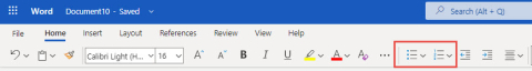
- Use lists to break up text and add organization.Image
- Use meaningful hyperlinks instead of listing the URL in your document.
Add the URL of a hyperlink to a text description of the purpose for clarity for your visual reader as well as a person who uses a screen reader. A screen reader will read out the entire URL which is meaningless to hear.Image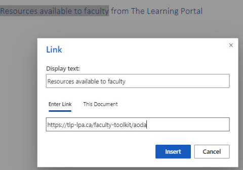
- Add alternate text to images
- Insert an image into your document. Click on the image and then on the Picture Tools menu
- From the Picture tools menu, select Alt Tags
- On the right panel, enter your descriptive textImage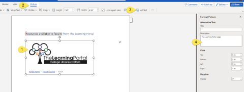
- Identify document language which helps screen readers interpret your document.
In MS Word Online, you click on the gear beside your profile picture and select Change Your Language.Image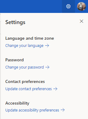
In the installed version of Word, use Options under the File Menu and then select Languages.
Image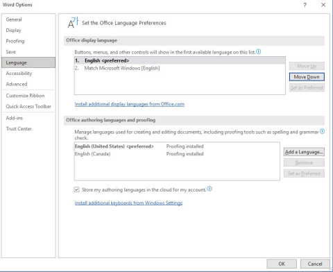
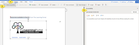
- Use the Accessibility Checker if available in your software.
The Accessibility Checker in Word can be found by selecting the Review Menu, then Check Accessibility on the ribbon. Your Accessibility report will display on the right hand side and notify you of errors that you can correct.Image